Update! See this post.
Hello folks! I know nobody asked for this (except me) but me and Nowea did some work this morning and figured we would release it to any interested parties.
We made an eye candy patch.
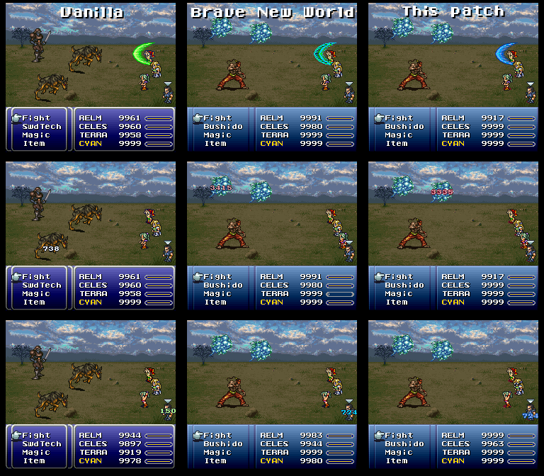
Terra casting Rasp on a reflective Relm, and using an Ether on Cyan (and yes, I made these using vanilla saves, hence the insanely high numbers which you would never see in BNW)
This patch (re-)redecorates the less-than-aesthetically-pleasing Rflect barrier that results from using Imzogelmo's Color-coded MP Digits patch. The barrier is now a pleasant blue recolor of the green vanilla version. As a byproduct of eliminating the dark grey color from the palette, the MP healing colors (blue) look somewhat brighter and have a nice glow to them. The MP damage numerals (pink) were recolored to match.
It has been (very, very briefly) tested with Brave New World 1.8.0 and vanilla FF3us 1.0. Please report any bugs you find to Seibaby on the ID Discord channel or here in this thread. Please be especially on the lookout for anything that is pinkish-maroonish but looks like it should perhaps be a dark grey.
Thank you for downloading this patch and please enjoy!
-- Seibaby (aka Cakes)
Gonna post this up for testing or something? I demand top billing
-- Nowea
(If you're wondering about the distribution of work here - Nowea did all the creative stuff and Seibaby did all the hacking stuff - yay teamwork!)
Nowea and Seibaby collaboration! Reflect Redecoration!
Page 1 of 1
#6
10 January 2017 - 01:14 PM
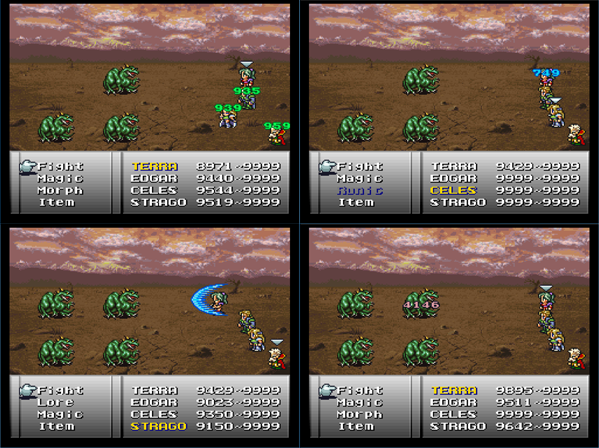
Update! A palette conflict caused character's shadows to turn dark red, which can be seen in the screenshots in the original post. As a fix, we decided on changing the HP healing numerals to match the MP ones instead; to minimize other potential palette conflicts, we made them brighter to boot.
I've updated the link in the original post.
Here's the new look:
Please be on the lookout for anything that is dark green but looks like it should perhaps be a dark grey (edit: or anything that is green that looks like it should be a brighter green, lol).
If for some reason you want the old patch, here it is.
"apparently greens are MUCH BRIGHTER than blues"
-- Seibaby
"You asked me to pick a new color for the border lol"
--Nowea
(If you're wondering, which I'm sure you're not, Nowea was not consulted for
his choice of words in the readme which were skillfully quoted out of context)
#7
10 January 2017 - 01:31 PM
Love the reflect, but really not digging the brightened healing, especially the green.
#8
10 January 2017 - 06:04 PM
I like the brightened healing. It's surprisingly loud, and for some reason is reminding me of how surprisingly loud Curaga was in FF8.
#9
10 January 2017 - 07:56 PM
The brightened MP healing is a result of changing the palette for reflect. Reflect and MP healing use the same palette and the reflect graphic uses all the colors. I could have tried making a reflect graphic with 1 less color but Sei wanted to see how this would turn out.
The healing HP color was changed to mimic the MP one
Share this topic:
Page 1 of 1