Development Discussion
#1
01 September 2014 - 08:17 AM
And because I'm now able to edit shops at will.
#3
02 September 2014 - 11:58 AM
In another news, I've just discovered a feature I thought my debugger of choice didn't have - A little button that tracks the label from where the current instruction takes the value. This little thing may seem small, but it was the missing link I've been having between the simpler hacking of SNES and the uberly complicated hacking of GBA. By the use of this little button, I was able to hack the duration of AreaGrab chips (possibly THE most abusive type of chips in single player) and decrease it at will, in a freaking split second. And I foresee lots and lots of rebalance changes, only possible thanks to that little button. Yay.
So in other words, you all will have to wait a little while, so I organize myself into distributing the different enemies throughout the whole game, so I can edit the shops once and in the best fashion. This will also mean that the next updates (which would take longer and longer to be released) will take not as long as I foresaw, because I'll have one of the most difficult parts of rebalance done, both in my mind and in paper (or rather, digital sheets lol).
I gotta say I'm progressively being hooked into this RPG modding. I thought it'd be too hard to actually enjoy it, but despite the difficulty of the planning and the multiple sheets and whatnot, I find it scratches that RPG itch I always had, and my creativity, and also my math itch. Yay!
#4
07 September 2014 - 10:20 PM
#5
08 September 2014 - 06:33 PM
Vexium, on 07 September 2014 - 10:20 PM, said:
You can most certainly be! The Beta Testers just need to play the game normally, but the thing is the next test version will take a while. But I'll add you to the list! Thank ya!
#6
09 September 2014 - 09:06 PM
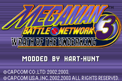
Totally unnecessary, but since I just wasted all this time starting it I thought I'd share it.
#7
09 September 2014 - 09:53 PM
JCOnyx, on 09 September 2014 - 09:06 PM, said:
Totally unnecessary, but since I just wasted all this time starting it I thought I'd share it.
...Wow, that's crazy. I fucking love it! That will be from now the official cover of the mod! If you can add "by Hart-Hunt" somewhere, that'd be so sweet. I'll update te download file with that image in the next version, and add you in the Credits section for it!
Edit to add: Also, if you feel like it, add somewhere else "Illustration by [your name]" But now that I think about it the picture will look awfully cluttered with any of those two included, right?
#8
10 September 2014 - 11:33 AM
Some questions I have for the final draft:
- Do you want me to include the version number anywhere in the photo for updates, like the top left corner or something?
- No "Press Start" or do you want to keep it there?
- I'm thinking I can fit your name next to the other copyrights at the bottom, same text and everything. Would that be good?
#9
10 September 2014 - 01:11 PM
JCOnyx, on 10 September 2014 - 11:33 AM, said:
No problem then.
JCOnyx, on 10 September 2014 - 11:33 AM, said:
- Do you want me to include the version number anywhere in the photo for updates, like the top left corner or something?
- No "Press Start" or do you want to keep it there?
- I'm thinking I can fit your name next to the other copyrights at the bottom, same text and everything. Would that be good?
1. I'd rather not keep the version number. That way there's no need to update the cover for each version released.
2. I actually would rather not have the Press Start. I'm glad you asked about it before I did .
3. Absolutely, that sounds great. If it is the same font, even better, but anything resembling it will be good.
Also, is that the highest res you can work with?
#10
10 September 2014 - 02:26 PM
Edit: Lol, I spelled your name Hart-Hart xD. Just a moment, fixing.
Also, just realized that you had edited your post asking about resolution. I actually had a higher res logo at first, but I wanted it at screen capture size for the final product (240x160). I don't have a completed logo saved at the higher resolution anymore unfortunately, but I do have one of the WIP states saved still. I could try and do a completely custom title screen at that higher resolution... but that might be beyond my abilities.
Here are just some simple scaling edits with a bit of sharpening:
#11
10 September 2014 - 03:07 PM
Hart-Hart
But yeah. You have talent.
#12
10 September 2014 - 03:16 PM
#13
10 September 2014 - 03:41 PM
Advent, on 10 September 2014 - 03:16 PM, said:
It is a possibility, I agree. But given the circumstances, I'd rather have it less cluttered to my like. The best option out there would be to have it as a title screen (yeah, right, tile molester).
#14
10 September 2014 - 04:02 PM
#16
11 September 2014 - 07:50 PM
After a bit of experimenting, I created a couple color variations that I liked as well.
#17
11 September 2014 - 08:03 PM
I'm definitely gonna go with one of the two in the bottom. The gold is tempting, but I think I'm gonna go with the Silver (always the minimalist choice for me). Which one do you guys like the most?
#20
11 September 2014 - 08:30 PM
And thanks again guys for the compliments. I just wish I could make the subtitle font a little more detailed, that's my only gripe :/