Forum Index Re-Design
#1
09 September 2013 - 08:43 AM
The Last Post and Last Active Topic features are still in the code, just hidden for now. I will re-activate them soon and include them somewhere on the new design.
Please discuss what you'd like to see on this topic.
BY THE WAY- Your forum index should look like this. If it doesn't then it means you have to reload your browser cache:
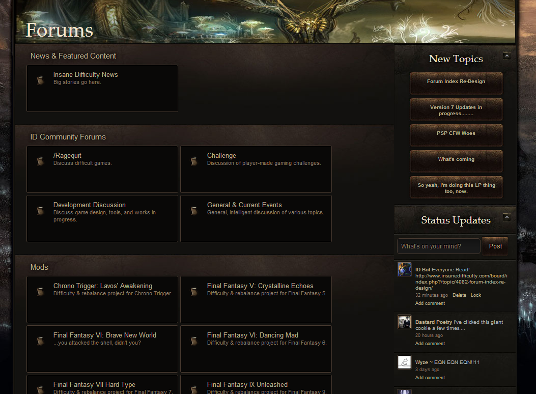
#2
09 September 2013 - 09:33 AM
EDIT: Try decreasing the box size by about 30% and see what you think
#4
09 September 2013 - 09:52 AM
#5
09 September 2013 - 09:57 AM
auraplatonic, on 09 September 2013 - 09:33 AM, said:
That gap is where the missing features are going to be. Stuff like SubForums, Last Reply, author, etc.
I can put that info over on the right and make the boxes shorter, though.
#8
09 September 2013 - 12:36 PM
I still wish to know why you're changing it in the first place, of course. x]
#9
09 September 2013 - 01:38 PM
#10
09 September 2013 - 03:05 PM
I prefer lists still, but that's the old/mid schooler in me. All this fascination with buttons either results in too much space or multiple clicks via menus to go anywhere. My desktop is icon heaven/hell, viewer pending.
Its like a lot of people are going back to the AOL designs with the advent of Smart Phones/Tables.
#12
09 September 2013 - 03:27 PM
ID Bot, on 09 September 2013 - 12:35 PM, said:
Anything you'd like to add / change?
I'll wait until the missing elements are there to comment, but as of right now no I think it looks really good.
Kaffe Myers, on 09 September 2013 - 12:36 PM, said:
Arch does this every so often. The last time was brutal and not nearly as intuitive as this one. We call it the Clutter Crusades.
#13
09 September 2013 - 03:33 PM
#14
09 September 2013 - 03:35 PM
Kaffe Myers, on 09 September 2013 - 03:33 PM, said:
I think it's just the desire to change things up. I did something similar every few months or so when I played World of Warcraft. I'd tear down my UI and rebuild it from the ground up, differently each time.
#15
09 September 2013 - 04:03 PM
Okay now for real feedback, it's a good step towards the right choices I think. It looks pretty not good right now, but all progress demands sacrifice. I think to go back to the way it was before would be a mistake. All it needs is a better look and it'll be better than it was before.
#17
09 September 2013 - 04:09 PM